
2022 STARS Awards

The Miller Residence – 2004

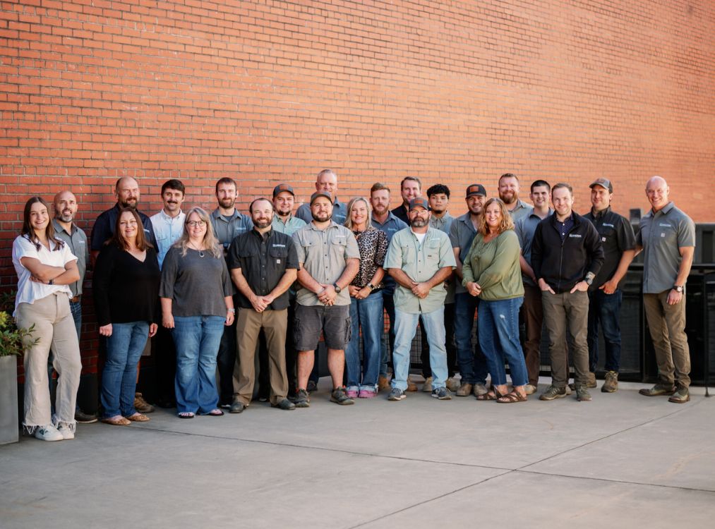
STARS Awards – North Carolina Home Builders Association

Living Stone: Completing the Green Experience

Eight Principles of a Healthy Home

Living Stone Wins Prestigious State Award for our Safety Program

Living Stone chosen as #1 Best Custom Home Builder in NC!
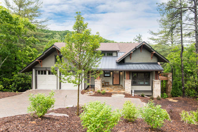
The Ava Simone for the Barbers in The Settings of Black Mountain

This House Smells -The Dangers and Opportunities that IAQ Present in Homebuilding
“This house smells…different than the rest. Actually, it doesn’t really have a smell?!” said Mrs. Lee as she walked into the Parade of Homes entry I was manning last year. Mrs. Lee, like many other visitors in years past, noticed what most builders are missing across the country, the fact that IAQ is important.
I had the privilege, two years ago, of sitting in a research lab think tank with seven other top builders from across the nation. The question was posed to us “What is the greatest concern that you have about the homes that you are building today”? Each builder at the table said that they were concerned about building homes so tight that they might be poisoning the people that move into them. When they got to me, I was dumbfounded by their answers and had to ask my own question, “Are you using a rater”?

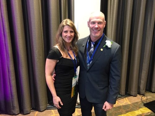
Local Asheville Builder Named by NAHB as Certified Green Professional of the Year

January 10, 2017
The National Association of Home Builders last night honored 12 individuals who have excelled in teaching NAHB education courses and for their professionalism as NAHB educational designation holders as the Educators and Designees of the Year. The awards were given during the 2017 International Builders‘ Show® held this week in Orlando, Fla.
“These home building industry professionals definitely ‘walk the walk,’” said 2016 NAHB Education Chair William L. Shaw, Jr., GMR, CGR, GMB, CAPS and CGP, a Houston remodeler and NAHB instructor. “These leaders don’t just talk about the importance of education. They also work to stay current and even ahead of industry trends so they can set an example for the home builders, remodelers and other industry professionals who make up our great Federation.”

Project Wins National Green Building Award
 Black Mountain, NC, Living Stone Design + Build project, “Rhodo Reno”, is the overall winner for the Best Renovation in the 2017 National Green Building Awards by the National Association of Home Builders (NAHB).
“The NAHB Green Awards represent the best of the best in green building practices and advocacy efforts, and this year’s group of winners is particularly impressive,” said NAHB Chairman Rick Judson, a home builder from Charlotte, N.C. “The demand for green building is growing exponentially, and these honorees are a great example of what can be accomplished in terms of sustainable and energy-efficient building practices.”

Local Builder Honored with National Design Award – Living Stone Design + Build
Asheville Achievers – Laura Sullivan ID.ology Interior Design
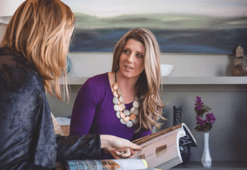 Laura Sullivan is a woman in a man’s world. It started as a child, when she’d accompany her father to job sites, getting her hands dirty throwing materials in the dumpsters in his investment properties. It continued during school, when she combined her passion for art with her experience in real estate to earn a degree in interior design (and a minor in art). Upon graduation from college, Sullivan invested further in that traditionally masculine world, as she received both her real estate broker’s license and her contractors license.

NAHB Honors 5 Young Professionals

Living Stone Wins Green Design + Build Firm for North Carolina
The 2016 Southern Living Inspired Home: A mountain home at one with its setting
By Charles Richardson
A timeless setting
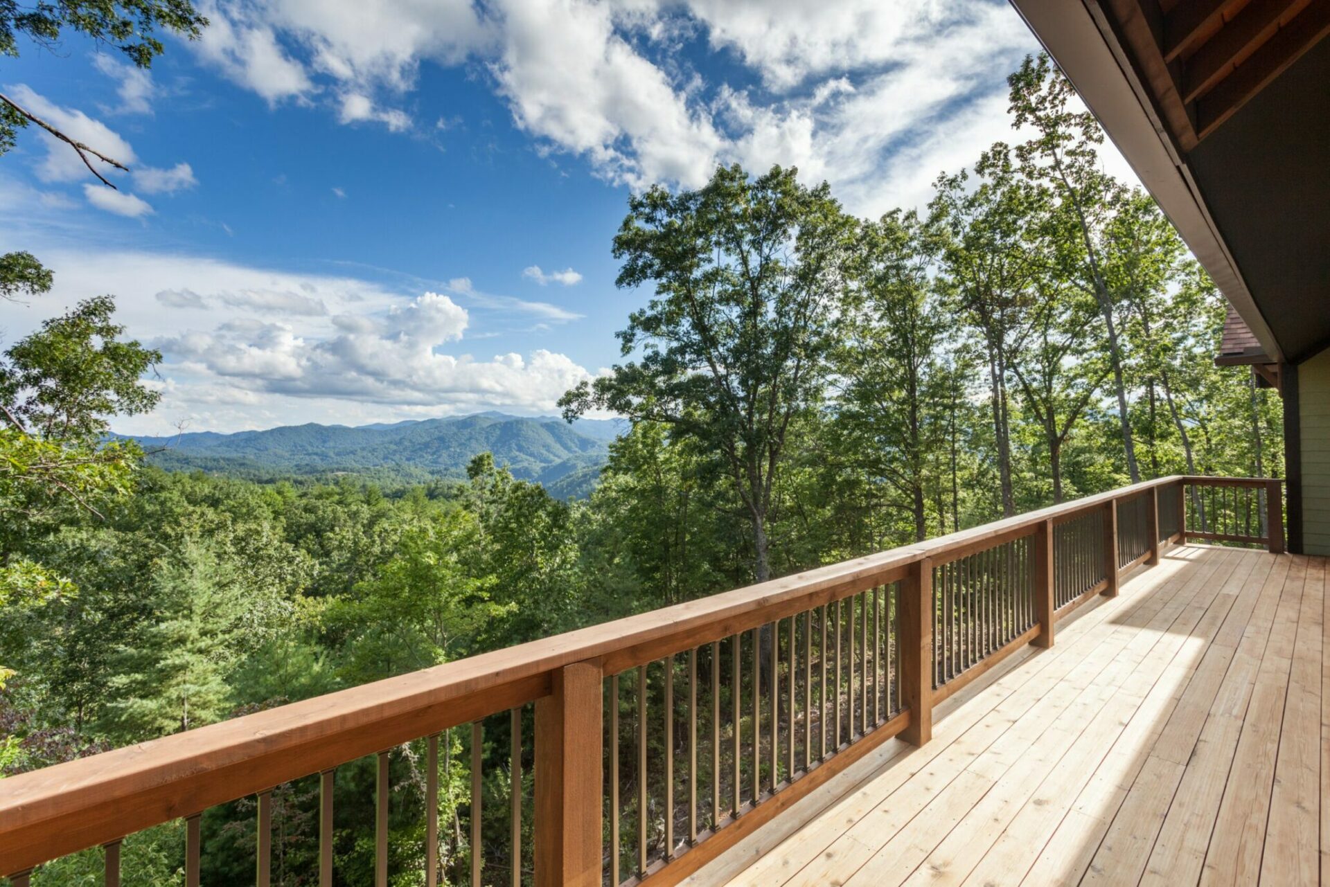
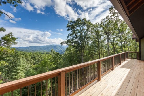
The first thing you notice about French Broad Crossing (FBC) is the exquisite Western North Carolina setting: pure, pristine, secluded, and in perfect harmony with the lush, densely forested hills that form a natural amphitheater of majesty and timeless beauty. Residents here liken it “to living in one’s own national park,” yet it’s just a short drive from the dynamic city of Asheville, NC. Indeed, much of the land at FBC is permanently preserved, held in conservation to prevent further development. Families are drawn to an idyllic living experience that can be passed down to future generations, in the same undisturbed state that exists today. It is here, against the backdrop of ancient rolling mountains and the mighty French Broad River—third oldest river in the world according to geologists—that the new 2016 Southern Living Inspired Home will reside.
Growing Options for Seniors Ready to Move
 Submitted by Sean D. Sullivan
For many seniors, making the decision to move or downsize to a smaller home can be emotionally challenging. After raising a family or spending a good portion of their adult lives in one home, it is often difficult to think about leaving it. Yet, practically, it may be easier to live in a home that better accommodates their changing lifestyle.
To meet the growing need of these baby boomers, a new industry of “senior move managers” was created to help with the transition to the next phase of their lives. Senior move managers handle many aspects of a senior move. From setting up floor plans and helping determine what furniture to take, to packing the house and helping seniors sell or donate things they no longer want.
The National Association of Senior Move Managers provides resources and a directory of senior move managers across the country. Here are the three key things seniors should consider before they begin the downsizing process:
• It takes time. It is hard to imagine moving out of a home you have lived in for so long. Likewise, organizing all of the steps involved in a move can be overwhelming. Be sure to give yourself enough time to process the changes that will be taking place.

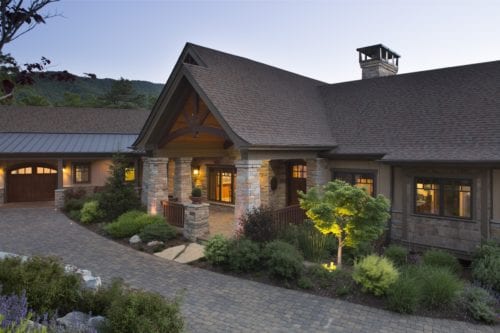
107 Raccoon Run, Marshall NC – Southern Living Inspired Home
$850,000 • 3 Bed, 3 Bath • 2,100 sq/ft • (828) 669-4343 • 70% Complete • License #49058 • www.LivingStoneConstruction.com
“The Water’s Edge is a classic example of how to design+build mountain living to maximize views. This home works for anyone, but especially those who are looking for style.”
Special Features:
A Southern Living model home
Universally designed for main level living and aging-in-place
Master bath wet room with undermount tub
Beams, wainscoting, millwork and built-ins
Second floor suite with adjacent reading loft and ‘ready-to-finish’ basement
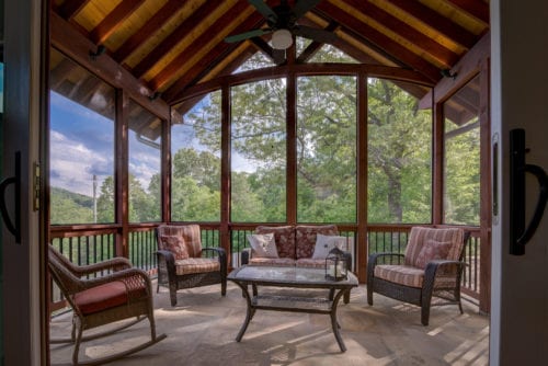
Incredible great room with wall of glass and over-sized slider doors
Covered back porch with fireplace and incredible mountain views!
An Energy-Star and Greenbuilt NC certified home

Entry-level Homes Making a Comeback
Submitted by Sean D. Sullivan, Living Stone Construction Inc.
 Waist size. College tuition. Kidney stones. Many things in life don’t get better as they grow bigger. Often times, the best things comes in small(er) packages.
In recent years, the tiny-home trend has taken that philosophy to the extreme. But it hasn’t quite caught on with mainstream America. The overwhelming majority of home buyers still prefer to own an abode with ample space in which to live, relax and entertain.
The median size of homes built in 2015 was bigger than ever, and the portion of those homes with four or more bedrooms grew to 47 percent. But so far in 2016, the median home size appears to have reached a plateau, leveling off after several years of gradual growth.